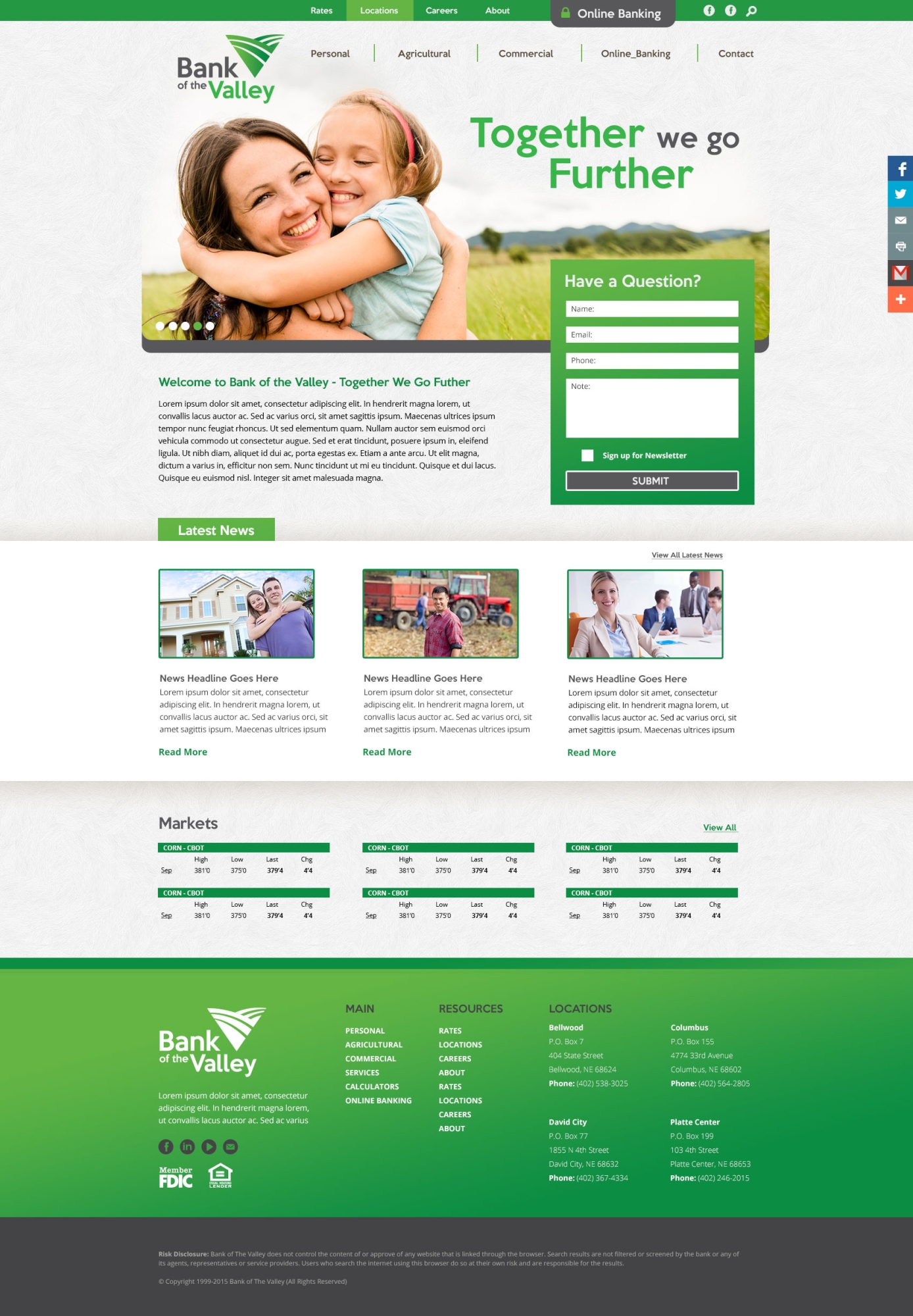
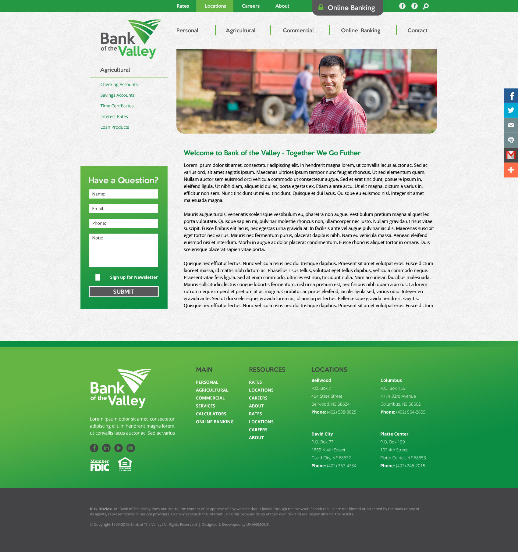
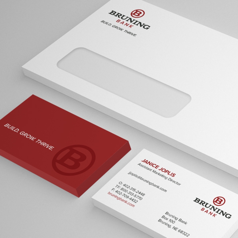
A Nebraska-based community bank with five area branches, Bank of the Valley partnered with UNANIMOUS to reposition its brand. The 30-year-old organization was experiencing growth, yet its identity was not keeping up with the bank’s positive progress. UNANIMOUS created a comprehensive brand strategy, including a new logo, tagline, messaging, identity kit, indoor and outdoor signage, a new website, and commercial videos.
Bank of the Valley
Bank Branding, Logo Design, Web Design, & Video Production
BRANDING & MARKETING OBJECTIVES
- Create a fresh, memorable brand
- Engage current and potential customers
- Update the website’s brand and increase user-friendliness
- Mobile and tablet-friendly website
- Equip their internal team with a robust CMS that is easy to manage and update
Branding & Marketing Results
- Fresh, vibrant brand reflective of the bank’s modern practices
- Clean, organized website design focused on the user
- Average time on the website has increased by 56% to nearly 3 minutes per visit
- Total page views are up by 40%
- 30% of traffic is from mobile visitors
Bank Brand Design & Development
Brand development began with a discovery meeting — with Bank of The Valley’s key stakeholders — to shed light on the bank’s history, target audiences, strengths, challenges, market position, vision for the future, and competition. The onsite meeting also provided an opportunity to assess and audit logo usage at the branch.
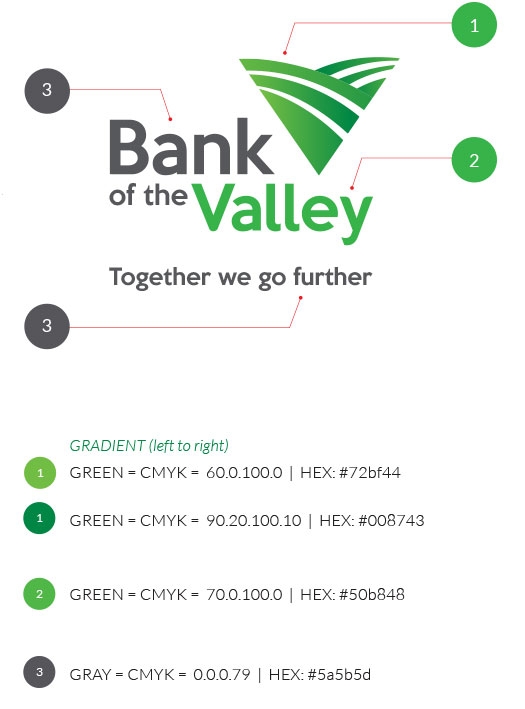
The new logo merged simplification with sophistication while staying true to the bank’s vision. A fresh, vibrant green as a primary color represented agriculture, growth, and banking. A “V” logomark was a nod to the valley and agriculture while providing a subtle landscape perspective. Modern typography was chosen to illustrate the bank’s commitment to forward-thinking, sensible banking.
Logo consistency: UNANIMOUS created a style guide for the new logo that defined the overall brand architecture, logo usage, color palette, typography, and other graphic elements related to the brand. The guide is beneficial by formally outlining the appropriate use of the logo across various applications, including receipts, signage, advertising, ATMs, and more.
Being new to such types of campaigns, it was a great introduction to the process, and I was able to learn a lot about our performance and how to take on the world of digital marketing. I'm a bit of a data nerd, so I would always appreciate more information and detail in our reporting, but again not knowing much about digital campaigns, this may have been all of the information we had to work with. Please don't interpret this as dissatisfaction with the process (we were really, really pleased with the outcome!!) but just as a comment on anything that could have possibly been improved.
DEE HANSON
Commercial Video Production
The UNANIMOUS team met with Bank of the Valley early in the video production process to discuss their video needs. Bank of the Valley was entering a new and widely diverse market by opening a new branch, so they needed a promotional video to cater to a specific audience.
During the video shoot, the UNANIMOUS video production team traveled to several businesses in the Schuyler community that utilize Bank of the Valley’s banking services. What differentiated this video from others was the desire to have visuals focused on the community members instead of focusing on the new bank.
After completion of the project, UNANIMOUS delivered the final video in a format compatible with Broadcast TV, organic and paid social, and Hulu.
Bank Website Design & Development
The Bank of the Valley Web Design & Website Development project represents a pivotal leap forward in our commitment to delivering an exceptional online banking experience. With a focus on user-friendly navigation, enhanced security features, and a visually appealing interface, we've reimagined how our customers interact with their bank website. The UNANIMOUS team of expert designers and developers has meticulously crafted a website that not only meets the modern-day needs of our users but also sets a new standard for digital banking. Welcome to the new era of digital banking with the Bank of the Valley - where convenience, security, and excellence come together to redefine your banking website experience. Click here to visit the live website.

Google Search Ads Campaign
UNANIMOUS partnered with Bank of the Valley to create and execute a highly effective Google search ads campaign. By deeply understanding the bank's target audience and strategic goals, UNANIMOUS crafted targeted ads that resonated with potential customers, driving increased traffic to the bank's website. The campaign was meticulously optimized for performance, ensuring maximum visibility and engagement, ultimately resulting in a higher conversion rate and enhanced online presence for Bank of the Valley.
Tags
Unanimous
8600 Executive Woods Dr. Suite 300 - Lincoln, NE 68512
Phone: 402.423.5447 • Toll Free: 888.317.5947
